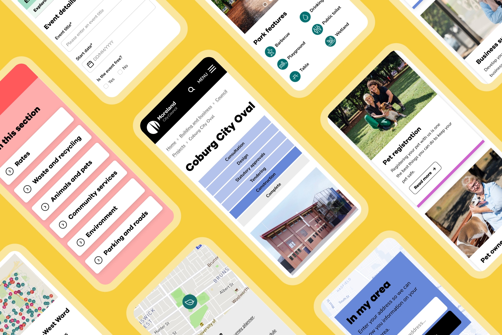
The Merri-Bek (formerly the City of Moreland) boasts some of the most diverse and vibrant suburbs in the north and stretches from the corner of Fitzroy North, through Brunswick, Coburg and Pascoe Vale, all the way to parts of Tullamarine. Moreland is home to more than 180,000 residents, including some of our own team here at Liquorice.
Merri-Bek is also Wurundjeri country, the traditional lands of the Woi wurrung people.
If you're a Merri-Bek resident, you're probably one of the 800,000 people who viewed their website last year. The site clocked a huge 3.5 million views on pages relating to council services, programs, events and general information. And after 8 years with no updates, it was time for a refresh.
A modern digital platform
Moreland City Council chose Liquorice to help design and build a new website – one that would help the Council stay up-to-date with industry standards, improve their online experience and express themselves as the modern and accessible organisation they are.
The digital team kicked off the project with some research into best practice platforms for similar audiences and a review of the existing website, including information architecture, content and interface design.

By getting to know the current site, its strengths and limitations, and by gathering some external inspiration, we're able to start connecting the dots between where we are and where we want to be.
The design strategy workshop allowed Moreland Council and Liquorice to discuss the research and IA recommendations and agree on a path forward. An initial round of design produced a draft style guide and a some early template designs, and feedback on those designs was incorporated into the next design round.

When we design a website, we don't design every page from scratch – we use page templates. By designing one robust page template, we can build a number of unique pages that all display content in a consistent way, saving time, effort, and giving users a seamless experience from page to page.

Easier, faster, more accessible
After some further refinements, we built a digital style guide, designed all the elements needed to start building full website pages, and conducted quality assurance and accessibility testing. Finally, our digital team packaged up the code and delivered it to the Council technical team as part of the handover process.

The result is a refreshingly clean, bright and approachable digital platform. The vivid colours, simple use of text and refined menu options help to define content, making it easier to find what you need. Accessing the online services portal is a smoother process thanks to better user experience design. The new design is also more user friendly for residents of CALD backgrounds, those with disabilities and older people, and meets WCAG AA 2.1 accessibility standards.
Credits
Services
Project team
Visit