Kolmeo
Bringing love to proptech
- What we did
- Strategy
- Brand Communication
- UX & UI
- Web Development
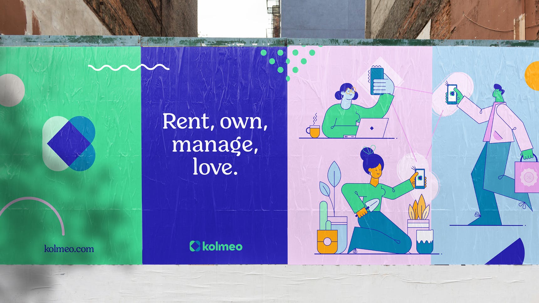
The brand
Kolmeo is a proptech startup for the next generation of agencies, owners and tenants. Property management is a tough gig for everyone. Property managers are overwhelmed, tenants are disengaged and owners want better communication.
The people behind Kolmeo knew it didn’t have to be this way, and they set about reimagining these experiences. By making day-do-day tasks more engaging, productive and fun, Kolmeo aims to help people to LOVE property management.
Liquorice was engaged to bring the Kolmeo brand to life, and to reflect its philosophy of balance, simplicity and fun through every touchpoint.
Did you know? Kolmeo means triangle – that’s owner, tenant and property manager together in harmony.
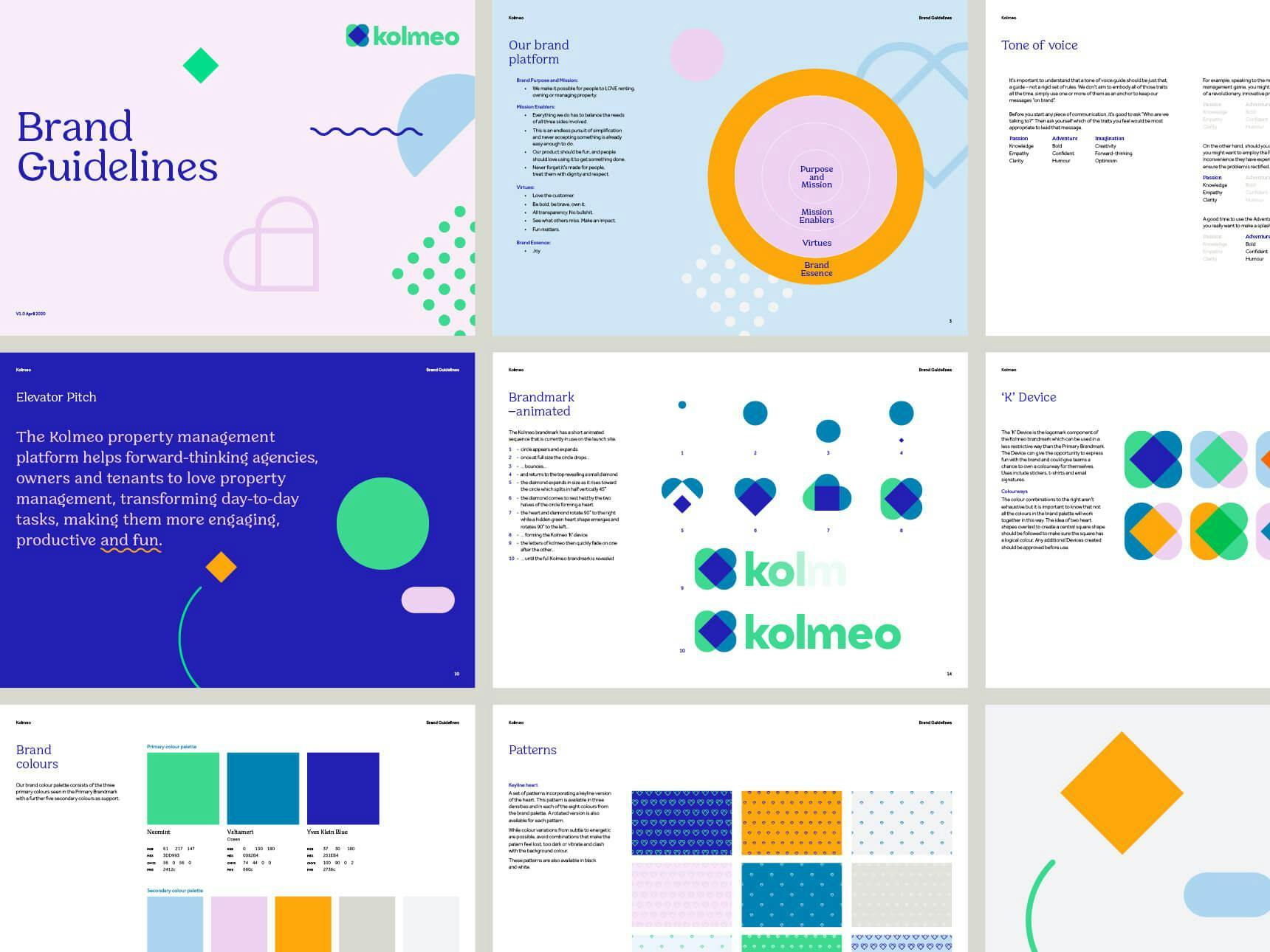
This pursuit of balance and harmony was central to the development of the brand strategy, which spanned brand personality, tone of voice, tagline, value propositions, a core brand narrative and elevator pitch. A lot of words go into a brand strategy, but one word really stood out from the rest – Joy.
Joy became Kolmeo’s brand essence; its core ingredient.
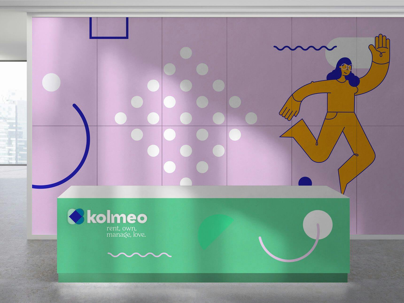
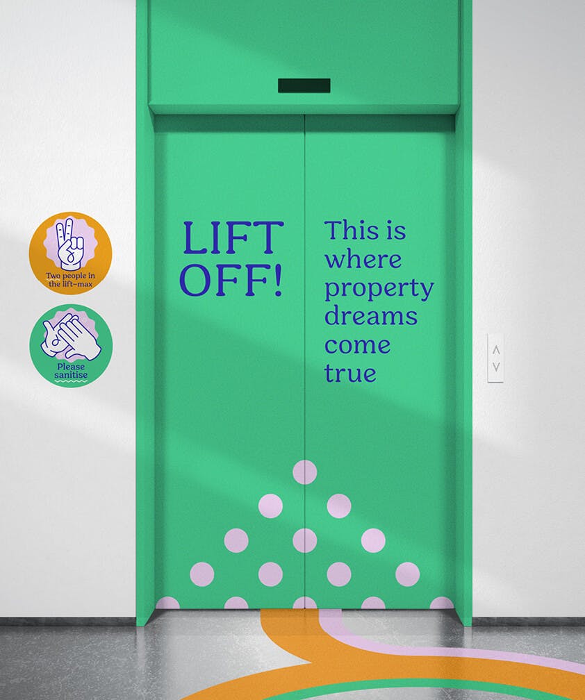
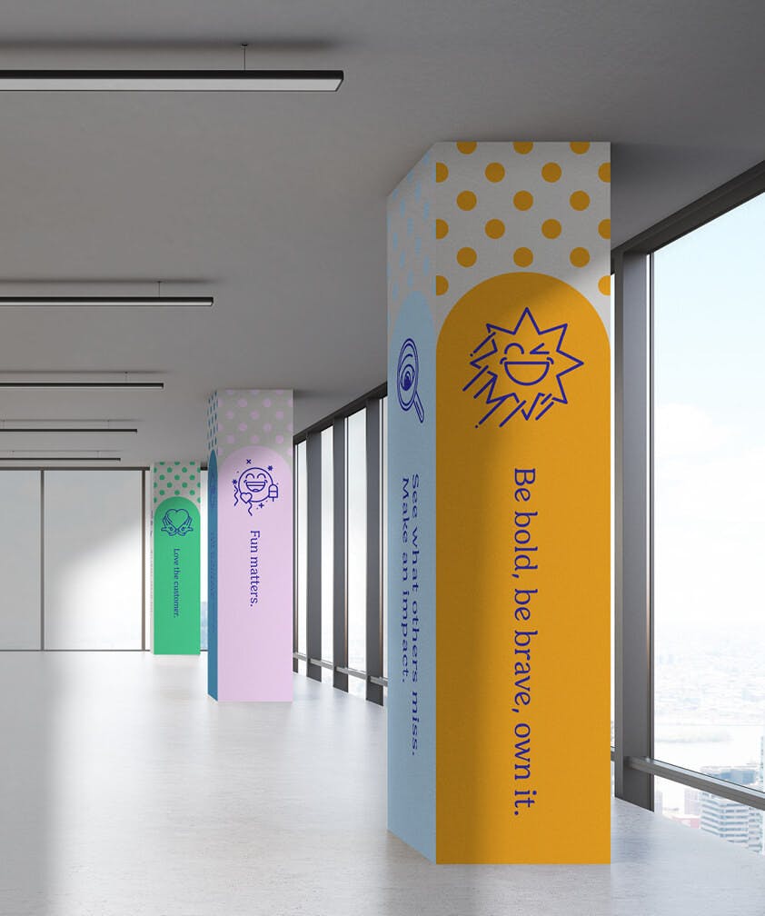
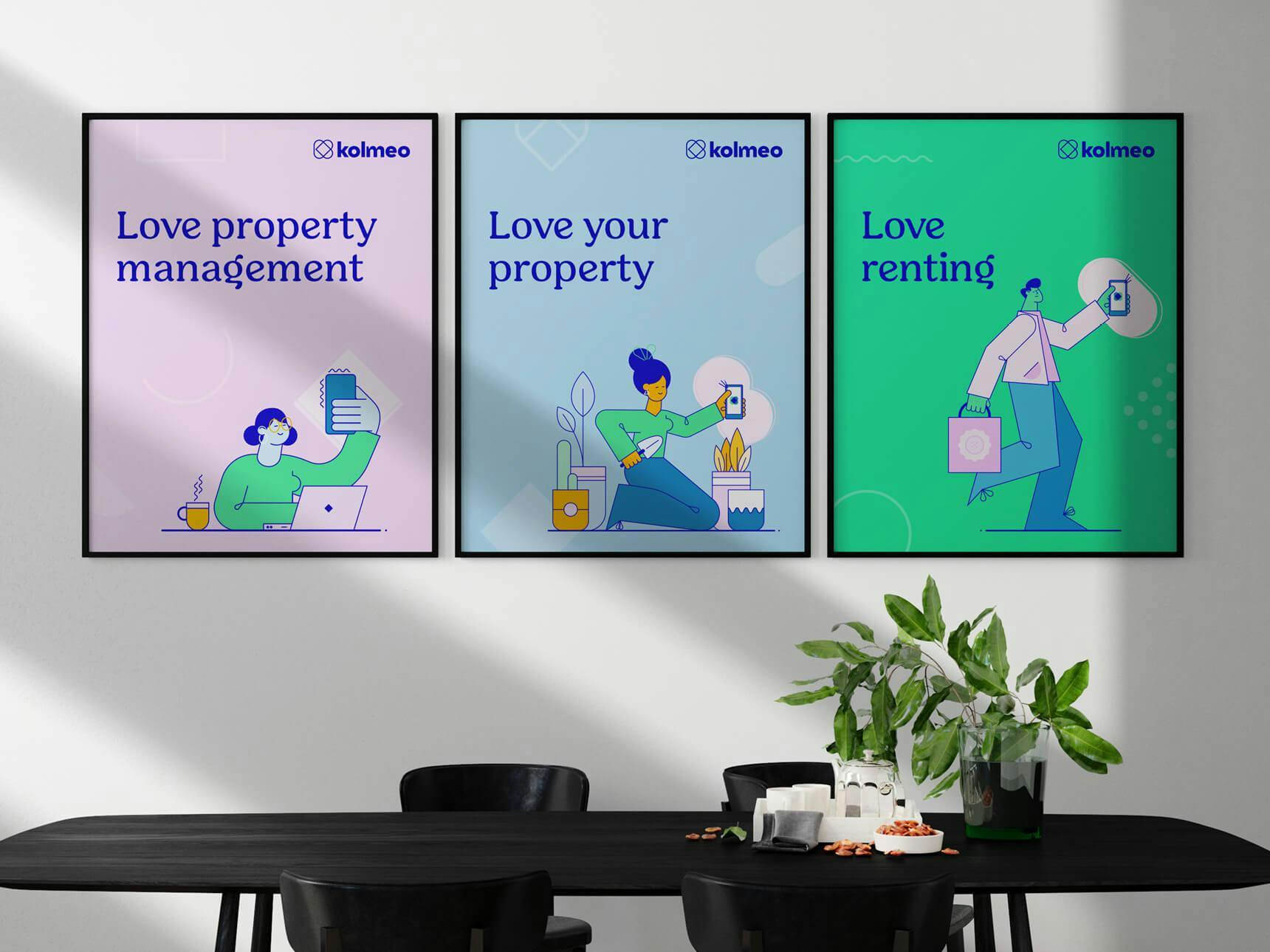
You’ll see this sense of joy in every piece of the brand identity. The vibrant brand mark with a hidden heart supported by the tagline "rent, own, manage, love" communicates the love of property, and quirky typographic details, a suite of playful patterns, icons, illustration and animations complete the identity system.
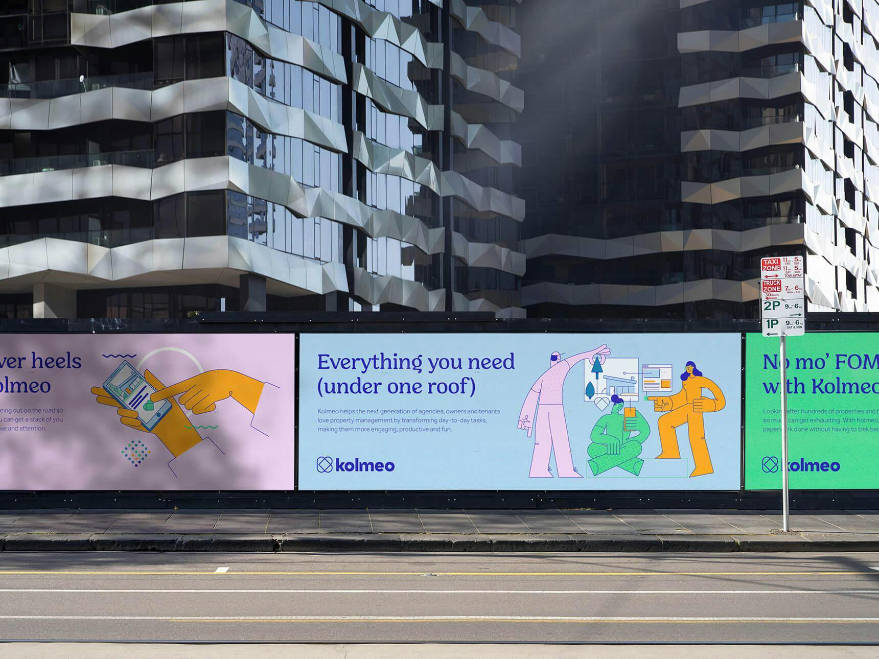
Kolmeo trusted us to extend our expertise to almost every corner of their brand, from designing launch collateral and signage, designing and developing a marketing site, and helping them to perfect UI for the app itself. The outcome is a flexible, holistic brand that is impactful and memorable.
We’ve had the pleasure to work with the Liquorice team on rebranding our business to Kolmeo. The team have created our wonderful, vibrant and fun brand identity as well as worked on several key projects along the way such as our website, app UI, office signage and customer collateral. Our new look really represents the type of business we are building and we always get wonderful feedback on all the Liquorice work, both internally and externally. It’s very much a call to arms for our team and we’re all super proud and excited to have such fun branding to support us.
— Narina Amvazas, Kolmeo Head of Brand
The website
Liquorice was also asked to design and develop a marketing website to promote the Kolmeo apps, showcase the features and benefits, and to introduce clients to the organisation.
When we design a website, the user is always at the forefront of our minds. We believe a thorough UX process is critical to truly understanding their needs—research into the demographic, motivations and pain points of these users, as well as the development of personas, user journeys and prototype testing all play a role in crafting the best solution. We also conducted research to inform the design direction and functionality requirements. This groundwork provided a solid foundation for wireframing where we outline drafts of the site before progressing to high fidelity designs.
The “make it fun” approach
We aimed to mirror the joy and fun of the brand strategy by including interactive elements like the scrolling features module on the home page, and colourful hover & click states in the primary navigation. A subtle use of pattern, playful illustrations and unique animation techniques really helped to bring that joyful energy to the experience. This approach also helped to increase the level of engagement with often overlooked sections of the website, like the staff portraits with their playful shape overlays.
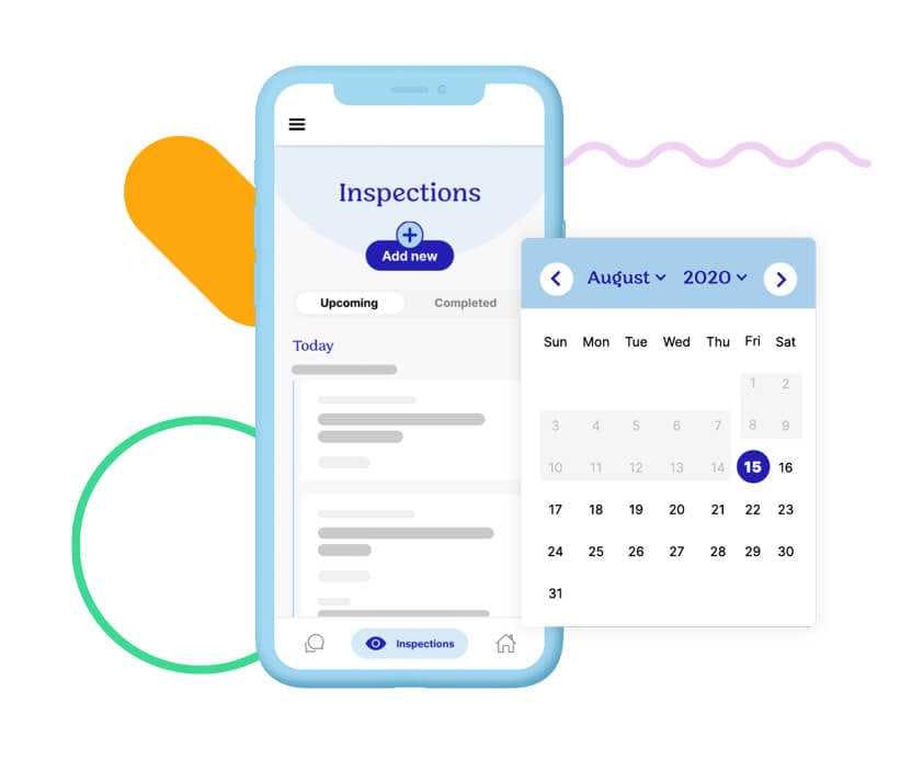
Kolmeo also trusted us to create content for the site, helping to ensure the brand was applied consistently across every touch point. Our witty, tongue-in-cheek approach to copywriting ensured the brand’s tone of voice shone through, while simplified mockups of the lovely app interface helped to highlight specific features and benefits. We even created an interactive pricing calculator to help users understand how the pricing structure works and determine which tier they fall under.
Technology stack: We used Wagtail as a headless CMS to feed an API which was consumed by a VueJS frontend.
App UI and components
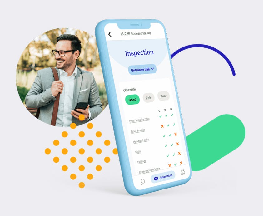
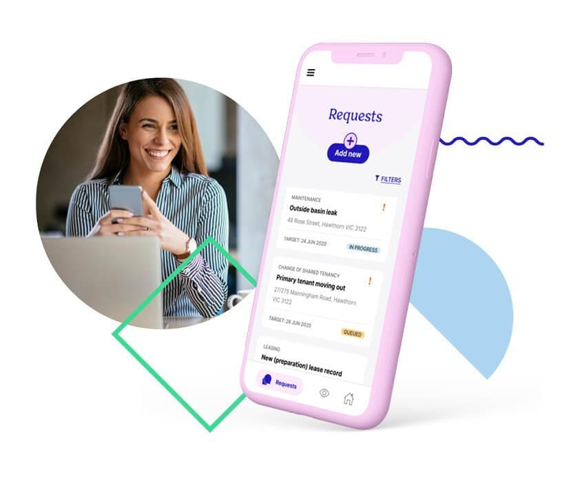
Kolmeo's product team set out to develop a world-first app which reimagined the property management experience, with simple frontend functionality for tenants, property managers and owners, and a powerful backend system using AI, API integrations and customisable interfaces. To solidify their position as challengers in the property management space, Kolmeo needed to ensure their bold new brand and positioning was reflected in the product UI.
Our challenge was balancing the adventurousness of the brand with the need for usability and intuitiveness, pushing boundaries with technology and functionality, but never leaving users behind. Kolmeo trusted us to find that balance, to envision the app end-to-end, and to lead the way towards a unique solution.
By defining Kolmeo's design principles first, we were able to establish guidelines for applying the brand to the product. These design principles were lead by Kolmeo's three brand personality traits:
- Adventurous
- Passionate
- Imaginative
We created specific design goals, each nested under one of the three traits, and used them as the jumping-off point for all thinking and concept generation.
We looked at how we could apply colour, shape and language to the existing UI components, app and dashboard screens, adding personality without reinventing the wheel. We also looked at how we could simplify screens to make them more accessible to users. We collaborated with the Kolmeo design team throughout the process, ensuring the design recommendations would work with the product functionality.
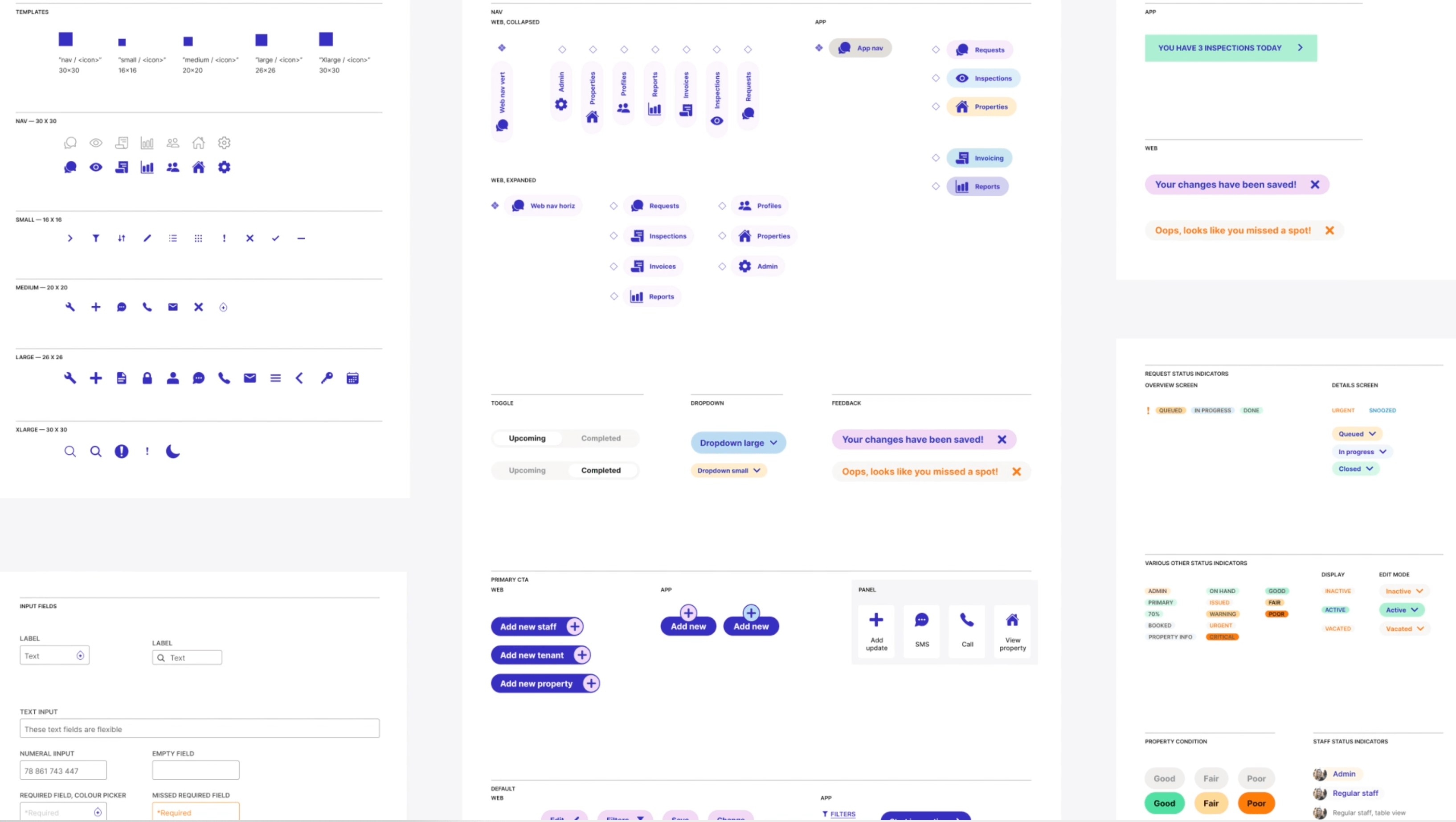
We refreshed the UI by applying the new Kolmeo brand and design principles, as well as injecting personality with unique animation, illustration and pictograms. Lastly, we created digital style sheets within Figma which included iconography, buttons, typography, cards, components and more, which became a usable guide for Kolmeo's product team.
This process transformed the Kolmeo app, taking a generic property management application and creating an innovative product that resonates with the modern day property managers, owners and tenants.
What's next?
We continue to work closely with the brilliant Kolmeo team, collaborating across all digital and brand experiences, from planning an upcoming brand shoot, developing a suite of animated explainer videos, and making regular updates to the website as the Kolmeo offer evolves. So, watch this space. We know the future is bright for Kolmeo. They have a bold vision to transform their industry, and we are proud to partner with them through the next stages of their joy-bringing journey.

Credits
Services
Brand Strategy
Digital Direction
Digital Strategy
Creative Direction
Brand Identity Design
UX Design
UI Design
Animation
Front-end Development
Back-end Development
Project team
Anna Gowers: Brand Strategy
Shane Loorham: Creative Direction
Jim Yencken: Digital Direction
Andrew Fiscalini: Animation, Brand Design
Jayne Halsey: Digital Design
Steve Mitchell: Digital Design
Emerald Cowell: Project Management
Hammy Goonan: Technical Direction
Vivian Genato: Development
Tom Bredin-Grey: Development
Madeleine Baud: Copywriting
Marion Piper: Copywriting
Visit
kolmeo.com
