Psyche
A new digital magazine from the team at Aeon
- What we did
- Brand Communication
- UX & UI
Psyche is a new digital magazine from Aeon, that launched May 2020. Psyche seeks to illuminate the human condition through three prisms: mental health; the perennial question of ‘how to live’; and the artistic and transcendent facets of life.
We worked with the team from Aeon + Psyche through a deeply collaborative creative process to help them define the visual tone of their new magazine, its brand identity, ultimately culminating in the design of a rich user experience and interface for the new platform.
Our project team had previously developed the visual identity for Aeon’s charitable foundation, the Psyche Foundation which was a fantastic collaborative and creative process, and having also enjoyed many a deep-dive read on Aeon, we were excited to embark upon this new challenge.
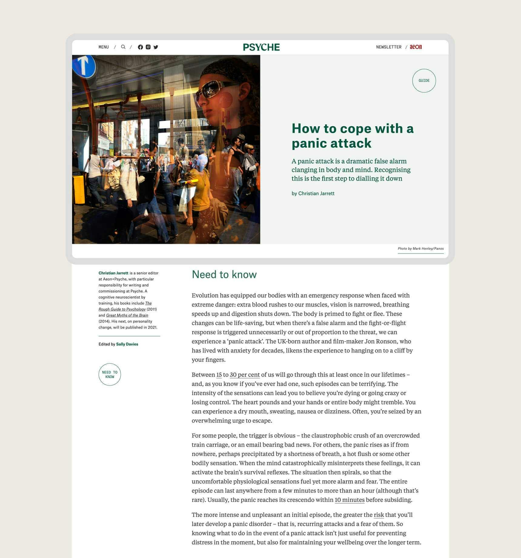
The Psyche team wanted to create a space of respite - a sanctuary away from what is usually found online. Our brief was to visualise this new digital magazine, complementing and referencing its sister site, Aeon, without being anchored to the existing site design. Aeon has an incredibly loyal international following, and serving this audience’s needs was vitally important to take them on the journey. But Psyche represents a new set of possibilities and the design language needed to open itself to these. A key requirement of the brief was that the design must be ‘content led’, creating a clean, immersive reading and viewing experience. The design would be in service to the content and the reading experience central.
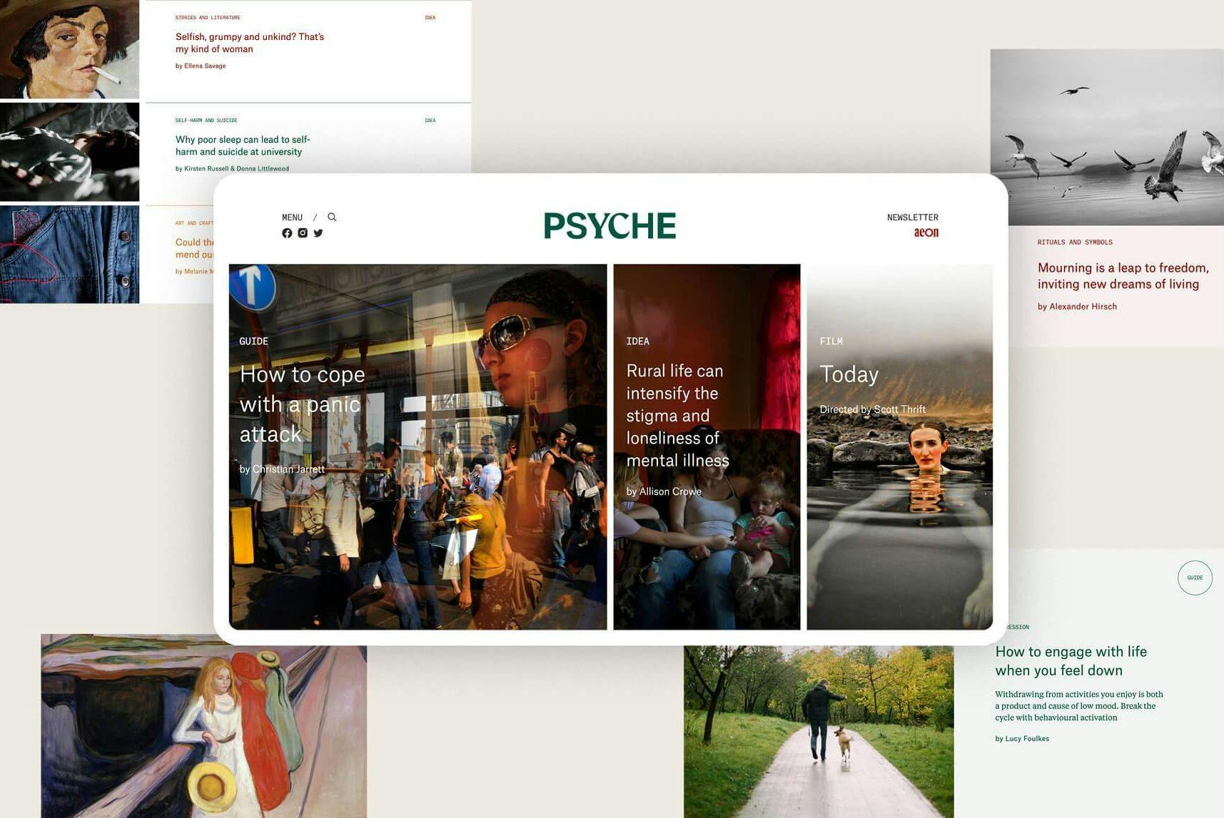
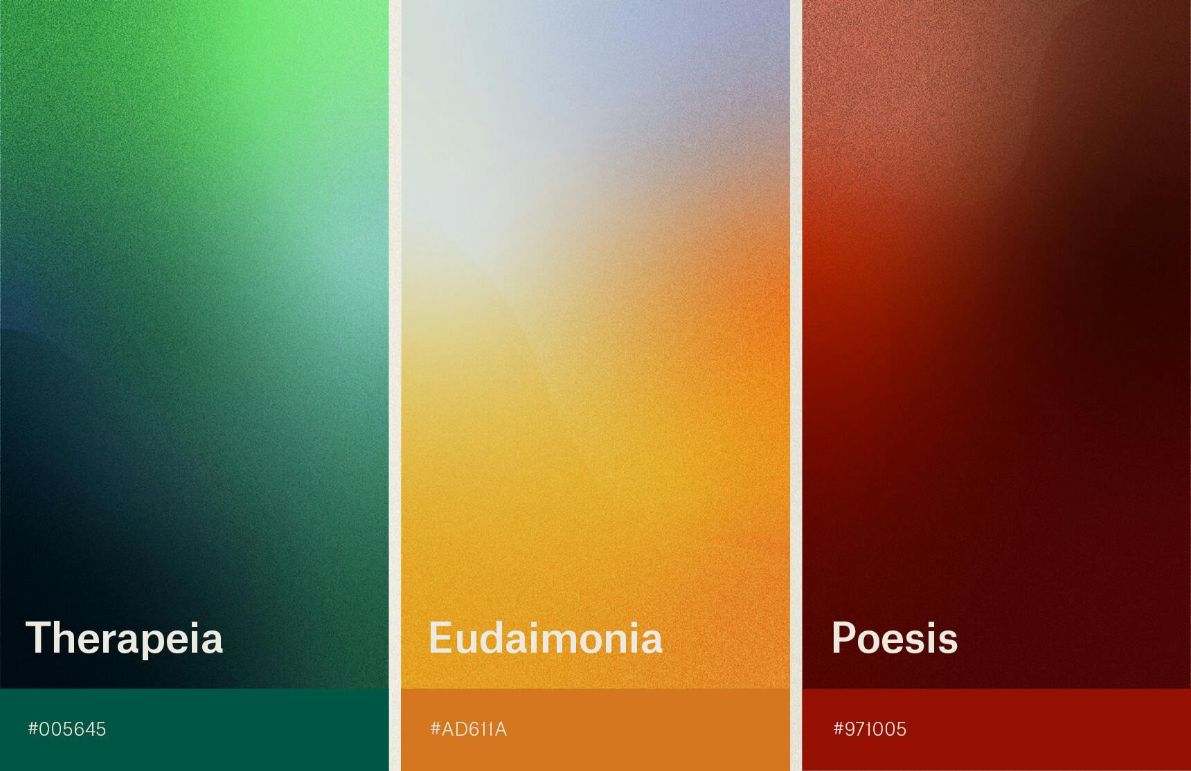
The home page acts as a portal into the world of Psyche. Familiar elements reference the Aeon universe while distinctive new qualities set it apart and establish a new tone. Three sliding windows introduce the three unique content types, inviting users to explore the latest in ‘Guides’, ‘Ideas’ or ‘Films’. Colour becomes a cue, subtly referencing the three distinct magazine sections; ‘Therapeia’, ‘Eudaimonia’ and ‘Poiesis’.
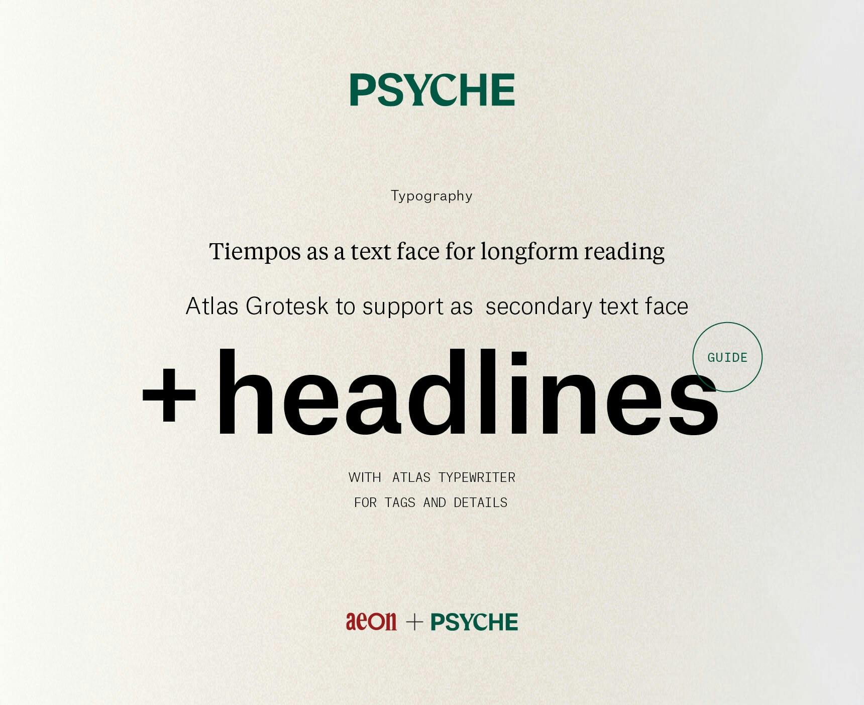
The curious construction of Psyche’s masthead refers back to its sister Aeon, through a similar plurality of typographic forms. Serif and san-serif characters interplay to represent the diversity of editorial inclusion. The colour of the masthead changes to match the content as a user navigates through the magazine’s sections. A deep green signifies the practical, helpful and healing qualities of Therapeia, a golden hue standing for the positive state of wellbeing explored through Eudaimonia, and a rich crimson representing the imaginative, artistic and transcendent facets of Poesis.
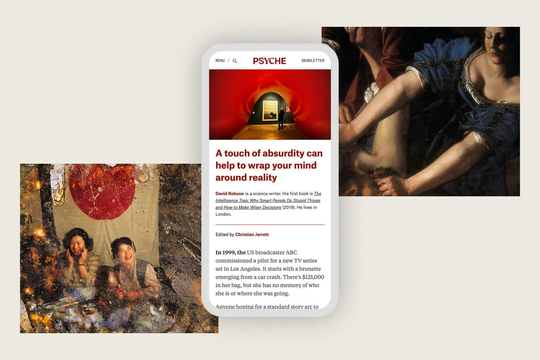
The typography across Psyche is, like its masthead, an evolution from Aeon’s visual DNA. The retention of certain fonts helps the Aeon reader to move between the platforms with minimal friction, while the introduction of a new text face provides for a refreshed reading experience. Line lengths, stand firsts, pull-quotes, tags, buttons, every graphic detail has been rigorously considered and refined to provide a beautiful reading experience across responsive browser sizes.
We are thrilled with the site, newsletters and social. It has been such an enjoyable process working with the team. From the start, Liquorice intelligently picked up what we were trying to achieve and have been nothing but professional and accommodating since.
— Kirsten Freeman, Chief Operating Officer
It’s been such a pleasure working with Liquorice, and a uniformly positive experience for the team - everybody is thrilled. At every step of the way there’s been an attuned, professional, responsive, creative quality to the relationship which has stayed true to the vision, and has been amplified in the design expression.
— Brigid Hains, Editorial Director
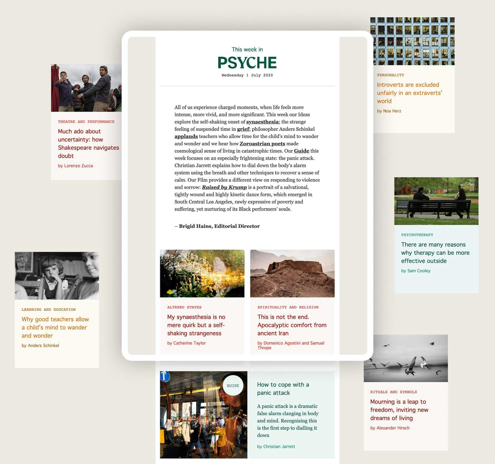
After handing over a complete website design we worked closely with the development team through a design review process. The site was built on the Aeon CMS as a reciprocal user and publishing database by the client's own talented development team. Following the build the editorial, video and illustration teams have taken the vessel we created and filled it with the most inspiring, rich and diverse content, with new surprises each day, which has been incredibly rewarding to see.
Thanks go to our wonderfully collaborative and trusting clients at Aeon: Paul Hains, Brigid Hains and Kirsten Freeman, and to their brilliant design and tech team: Matthias Siegel, Hector Kemp, Anthony Kolber and Bishal Shrestha.
Credits
Services
Brand Strategy
Digital Strategy
Brand Identity Design
UX Design
Creative Direction
UI Design
Project team
Shane Loorham: Creative Direction, UX/UI Design
Anna Gowers: Project Management
Steve Mitchell: UX/UI Design
Peter Binek: UX/UI Design
Visit
psyche.co